


Lightning Web Component Composable Pagination
Table of Contents:
Let’s talk about pagination — one of the common challenges in frontend development, particularly in the mobile-first world of consumer-facing web development, is in reducing the amount of vertical scrolling that your target audience is responsible for. As well, complicated DOM trees and long lists of elements being rendered tends to slow down browsers. Pagination solves both of these concerns by conditionally rendering elements on-screen, hiding the rest until the next page is requested by the user.
In this article, you’ll learn how to implement pagination properly in LWC, and unlock the potential of composable Lightning Web Components in the process. Composition over inheritance is one of the most crucial concepts in Object-Oriented Programming, but the Lightning Web Components documentation doesn’t give newer developers enough in the way of resources when it comes to building a complicated, reusable component — exactly what we’d like to do when implementing pagination. Indeed, the "paginator" component shown on the Trailhead LWC github is so barebones that I feel bad imagining somebody tasked with implementing a paginating component using that as a starting point.
Let’s get started:
Slot-Based Composition
In order to understand how the Web Components framework — which Salesforce has embraced with Lightning Web Components — enables the use of composition to create larger components from reusable component “blocks”, it’s important to review the basics of the <slot></slot>-based system. Consider the following LWC HTML markup:
<template>
  <section>
  <h1>{title}<h1>
  <slot></slot>
  </section>
</template>
Paired with your garden-variety JS:
import { api, LightningElement } from "lwc";

export default class TitleComponent extends LightningElement {
  @api title;
}
Now, in another LWC, you would add the remainder of your HTML-markup while making use of the header, and the <slot> is replaced by that markup:
<template>
  <c-titlecomponent title="Hello World">
    <div>
      <!-- the contents here would replace the <slot> -->
    </div>
  </c-titlecomponent>
</template>
In short, slot-based composition allows us to access the public properties/methods of components to inject the HTML that we want without duplicating the same markup everywhere. By itself, this example is a little too abstract — let’s begin with a more concrete example. You might remember from the React Versus Lightning Web Components article that there I introduced a simple “FAQ” component to compare between the two web frameworks. If you haven’t read it, or as a reminder, here’s what the example FAQ component ends up looking like:
<template>
  <template if:true="{faqs.data}">
    <h1
      class="slds-text-heading_large slds-align_absolute-center slds-m-top_small"
    >
      {title}
    </h1>
    <template for:each="{faqs.data}" for:item="faq">
      <lightning-accordion allow-multiple-sections-open key="{faq.key}">
        <lightning-accordion-section name="{faq.key}" label="{faq.question}">
          <small>{faq.answer}</small>
        </lightning-accordion-section>
      </lightning-accordion>
    </template>
  </template>
</template>
And the JS:
import { api, LightningElement, wire } from "lwc";
// just a stub method, returns 100 FAQs
import getFAQs from "@salesforce/apex/FAQController.getFAQs";

export default class FAQList extends LightningElement {
  @api title = "FAQs";
  @wire(getFAQs) faqs;
}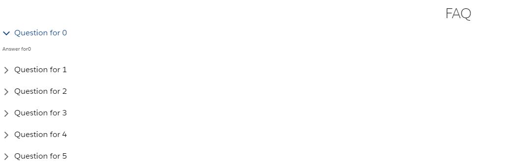
You could imagine this component being used in a Salesforce Community page — there’s just one problem. In the example, the FAQ is populated with a hard-coded list of 100 frequently asked questions. While that may be going a bit overboard, the fact remains that the FAQ component quickly grows too big to display on anything other than a tabbed flexipage; it dominates other components in the same view.
Starting To Paginate
Let’s introduce the concept of a wrapper pagination component using the power of <slot>s to begin reducing the viewport size of the FAQ component. We’ll also move the title property over to this wrapper. In the beginning, it’s going to need a clearly defined viewable section, and buttons to move through the current list of pages. We’ll walk through setting up the dynamically generated list of pages later:
<template>
  <section>
    <div class="page-data-container">
      <h1
        class="slds-text-heading_large slds-align_absolute-center slds-m-top_small"
      >
        {title}
      </h1>
      <!-- the crucial slot -->
      <slot></slot>
    </div>
    <div class="page-data-container">
      <lightning-button-icon
        alternative-text="Previous"
        icon-class="slds-m-around_medium"
        icon-name="utility:chevronleft"
        variant="bare"
      >
      </lightning-button-icon>
      <lightning-button-icon
        alternative-text="Next"
        class="slds-float_right"
        icon-class="slds-m-around_medium"
        icon-name="utility:chevronright"
        variant="bare"
      >
      </lightning-button-icon>
    </div>
  </section>
</template>
The JS:
import { api, LightningElement, track } from "lwc";

export default class Pager extends LightningElement {
  @api pagedata = [];
  @api title = "";
  @track currentPageIndex = 0;
  @track maxNumberOfPages = 0;
  // later, we might make this a configurable property
  // hard-coding for now
  MAX_PAGES_TO_SHOW = 5;

  renderedCallback() {
    this.maxNumberOfPages = !!this.pagedata ? this.pagedata.length : 0;
  }
}
And the CSS:
:host {
  --white: rgb(255, 255, 255);
}

.page-data-container {
  background-color: var(--white);
  max-height: 400px;
  overflow: hidden;
}
Now all we need to do is update our FAQ component to pass the data into the pager:
<template>
  <template if:true="{faqs.data}">
    <c-pager pagedata="{faqs.data}" title="FAQ">
      <template for:each="{faqs.data}" for:item="faq">
        <lightning-accordion allow-multiple-sections-open key="{faq.key}">
          <lightning-accordion-section name="{faq.key}" label="{faq.question}">
            <small>{faq.answer}</small>
          </lightning-accordion-section>
        </lightning-accordion>
      </template>
    </c-pager>
  </template>
</template>
That gives us this:
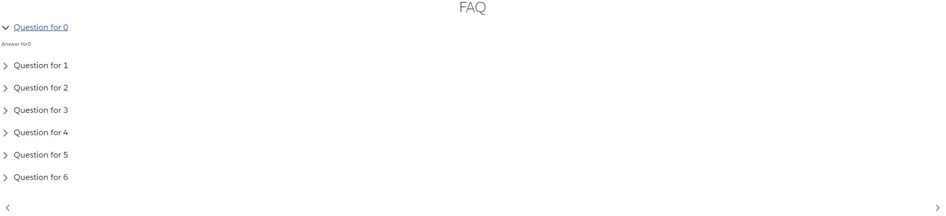
There’s only one problem (well, there’s a lot of problems, actually, but let’s take it piece-by-piece): all 100 of the FAQs are actually on the page at the moment; they’re just hidden due to the overflow: hidden CSS property being applied. At the moment, there exists a crucial disconnect between the data being passed in by the @track Apex API call and the output of the component; the pager doesn’t receive the rendered markdown in its pagedata property, but rather the raw data. Because we want this component to be generic, we have to prevent the pager from knowing about the internals of the markdown that will be produced. This means that we don’t need the pager to know that (in this case) a big list of <lightning-accordion-section>s will be part of the output; what we do need is to have the pager act as the middleman between the data being returned by Apex and the data that the component will use.
Starting To Actually Paginate
In order to do so, we’ll need to slightly re-work the pager’s JavaScript controller:
// in pager.js
// ...
@api
get currentlyShown() {
  return this.pagedata.slice(
    this.MAX_PAGES_TO_SHOW * this.currentPageIndex,
    this.MAX_PAGES_TO_SHOW
  );
}
// ...
Oh baby. Now we’re cooking with gas! Luckily, Array.prototype.slice actually handles sensibly the edge cases for overflowing the array; we don’t need to worry about the second argument being greater than the length of the array — if it is, slice will just return all of the elements up till the end of the list. There are some pagination-specific edge cases that will need to be tweaked on this property-getter, but this initial logic will do for the moment — we’ve got bigger fish to fry! Our child components will need to hook into this publicly-exposed method in order to drive their for:each HTML template directive, making it necessary to update the contents of the FAQ component:
<!-- in faq.html -->
<template>
  <template if:true="{faqs.data}">
    <c-pager class="pager" pagedata="{faqs.data}" title="FAQ">
      <template for:each="{currentlyVisible}" for:item="faq">
        <!-- etc ... -->
      </template></c-pager
    ></template
  ></template
>
An Aside On LWC Lifecycle Hooks
Note that the for:each template directive is being driven by a new property, currentlyVisible. Let’s step into the FAQ controller to see the rest:
import { api, LightningElement, wire } from "lwc";
import getFAQs from "@salesforce/apex/FAQController.getFAQs";

export default class FAQList extends LightningElement {
  @wire(getFAQs) faqs;

  @api currentlyVisible = [];

  renderedCallback() {
    this.currentlyVisible =
      this.template.querySelector("c-pager").currentlyShown;
  }
}
This exposes our first real hurdle in building the pager. The renderedCallback lifecycle method is supposed to be run on the parent component (the FAQ) when the child component (the pager) has finished rendering. Maybe there’s an issue with the rendering lifecycle when it comes to slot-based components. Maybe the Salesforce documentation on lifecycle hooks is out of date. Maybe there’s something else going on that a better developer than your narrator might be able to pinpoint (and shame on me, really, for assuming that the docs would lead the way). Whatever the case, the call to this.template.querySelector("c-pager") is hopelessly null during the renderedCallback lifecycle method.
To get around this, we’ll have to fire a custom event from the pager that components making use of the pager will subscribe to; we also need to expose the currently visible elements as an array:
// in pager.js
  @api
  get currentlyShown() {
// just your run-of-the-mill pagination edge cases
    const potentialPageStartingRange =
      this.MAX_PAGES_TO_SHOW * this.currentPageIndex >= this.pagedata.length
        ? this.pagedata.length - this.MAX_PAGES_TO_SHOW
        : this.MAX_PAGES_TO_SHOW * this.currentPageIndex;
    const potentialPageEndingRange =
      this.currentPageIndex === 0
        ? this.MAX_PAGES_TO_SHOW
        : potentialPageStartingRange + this.MAX_PAGES_TO_SHOW;

    return this.pagedata.slice(
      potentialPageStartingRange,
      potentialPageEndingRange
    );
  }

  renderedCallback() {
    this.maxNumberOfPages = !!this.pagedata
      ? this.pagedata.length / this.MAX_PAGES_TO_SHOW
      : 0;
    this.dispatchEvent(new CustomEvent("pagerchanged"));
  }
And then in the FAQ’s markup:
<!-- ... -->
<c-pager
  class="pager"
  pagedata="{faqs.data}"
  title="FAQ"
  onpagerchanged="{handlePagerChange}"
></c-pager>
<!-- ... -->
And in the FAQ’s controller:
import { api, LightningElement, wire } from "lwc";
import getFAQs from "@salesforce/apex/FAQController.getFAQs";

const PAGER_NAME = "c-pager";

export default class FAQList extends LightningElement {
  @wire(getFAQs) faqs;
  _currentlyVisible = [];

  _getPagesOrDefault() {
    const pager = this.template.querySelector(PAGER_NAME);
    return !!pager ? pager.currentlyShown : [];
  }

  @api
  get currentlyVisible() {
    const pages = this._getPagesOrDefault();
    return pages.length === 0 ? this._currentlyVisible : pages;
  }
  set currentlyVisible(value) {
    this._currentlyVisible = value;
  }

  handlePagerChanged() {
    this.currentlyVisible = this._getPagesOrDefault();
  }
}
Great. We’re back on track. The FAQ now loads the first five elements correctly. In a truly shared library, I would probably be importing this handlePagerChange function from a utils folder, or other shared-logic namespace. You can accomplish this in a variety of ways, but as an example:
// in lwc/utils/pagerUtils.js
const PAGER_NAME = "c-pager";

export function getPagesOrDefault() {
  const pager = this.template.querySelector(PAGER_NAME);
  return !!pager ? pager.currentlyShown : [];
}

export function handlePagerChanged() {
  this.currentlyVisible = this.getPagesOrDefault();
}
And in the FAQ’s JS controller we can now make use of those shared functions to alleviate the implementation burden:
import { api, LightningElement, wire } from "lwc";
import getFAQs from "@salesforce/apex/FAQController.getFAQs";
import { getPagesOrDefault, handlePagerChanged } from "c/pagerUtils";

export default class FAQList extends LightningElement {
  @wire(getFAQs) faqs;
  _currentlyVisible = [];

  getPagesOrDefault = getPagesOrDefault.bind(this);
  handlePagerChanged = handlePagerChanged.bind(this);

  @api
  get currentlyVisible() {
    const pages = this.getPagesOrDefault();
    return pages.length === 0 ? this._currentlyVisible : pages;
  }
  set currentlyVisible(value) {
    this._currentlyVisible = value;
  }
}
Since every consumer of the pager will need to use it, it’s also tempting to derive another base component that extends off of LightningElement. That would be a framework-level trap, unfortunately, as is evidenced by this sage tip dispensed within the LWC docs:
Inheritance is allowed, but it isn’t recommended because composition is usually more effective. To share logic between components, use a module that contains only logic. If you do choose to use inheritance, note that it doesn’t work across namespaces.
Unlucky. Solving for greater code reusability between components is one of the framework-level issues that I would really like to see improved upon in Lightning Web Components, especially because the @api decorated getters and setters for functions can’t be shared between components. Now, to make use of c-pager, I have this unwieldy coupling between:
- a public property,
currentlyVisible, which has to exist (regardless of what it is called) on each parent component - a private backing property,
_currentlyVisible(which is necessary to prevent an infinite loop) … - the setter for that property,
handlePagerChange, as well as the implicit coupling between this handler function and the event being emitted from the pager
React “solved” this problem with higher-ordered components and higher-ordered (curried, really) functions. Since I don’t have the option of enforcing this property to exist on each component making use of the pager, I will just leave off by saying that it makes the compositional re-use of a component like this more verbose than should really be necessary.
Returning To Pagination
To get the bare minimum necessary to paginate (now that the data is being properly filtered by the pager), all we need to do is wire up some click handlers for the pager’s next and previous buttons and emit the same pagerchanged event. Compared to the hoops we just jumped through, this is a walk in the park!
<!-- in pager.html -->
<lightning-button-icon
  alternative-text="Previous"
  class="slds-float_left"
  icon-class="slds-m-around_medium"
  icon-name="utility:chevronleft"
  onclick="{handlePrevious}"
  variant="bare"
>
</lightning-button-icon>
<lightning-button-icon
  alternative-text="Next"
  class="slds-float_right"
  icon-class="slds-m-around_medium"
  icon-name="utility:chevronright"
  onclick="{handleNext}"
  variant="bare"
></lightning-button-icon>
You can probably guess what the click handlers look like:
// in pager.js
handlePrevious() {
  this.currentPageIndex =
    this.currentPageIndex > 0 ? this.currentPageIndex - 1 : 0;
  this.dispatchEvent(new CustomEvent("pagerchanged"));
}

handleNext() {
  this.currentPageIndex =
    this.currentPageIndex < this.maxNumberOfPages
      ? this.currentPageIndex + 1
      : this.maxNumberOfPages;
  this.dispatchEvent(new CustomEvent("pagerchanged"));
}
The bare minimum pager now has the following concepts encapsulated:
- ability to dispatch currently visible items to parent components
- previous/next buttons to allow for paging between items
- the logic necessary to prevent overflowing the items in either direction (previous/next)
That’s pretty nice — and it might be enough for your use-case. Still, I think it would be hard to argue that a classic paging component was finished without the intermediary pages available.
Setting Up Page Ranges
Are you familiar with the Pareto Principle? As a student of economics, Vilfredo Pareto’s observations are widely discussed in classrooms. It was somewhat surprising that when I entered the world of software engineering, I found Pareto there waiting for me. Generally speaking, Pareto’s principle can be stated as:
80% of the functionality comes from 20% of the work.
As I sat writing the pager for this article, I was reminded of Pareto. I’ve done pagination a handful of times now, and there’s always some part of it that ends up being a bit more difficult than the other parts. Showing the page ranges in a satisfying way ended up being that “more difficult” part of this journey. Partially this was because I originally chose to exhibit the page ranges using lightning-button components; they looked great, but if you’ve used SLDS, you’ll know you can’t reliably override the base SLDS styles. The base lightning-button component also doesn’t support the slds-is-active stateful representation of clicked/unclicked. The stateful buttons require the use of an icon; while there are some really tremendous icons in the Lightning Design System, there aren’t any that represent numbers, making them ill-suited for our use-case in displaying page numbers. In any case, I ended up going with the plain HTML button to represent the pager’s page ranges:

So what did the implementation end up looking like? Let’s dive in, styles first:
:host {
  --white: rgb(255, 255, 255);
  --active: #f5edcc;
}

.page-data-container {
  background-color: var(--white);
  max-height: 400px;
  overflow: hidden;
}

button {
  background-color: var(--white);
  border: none;
  border-radius: 0.5rem;
  padding: 5px 10px;
}

.active {
  background-color: var(--active);
}
And the markup:
<template>
  <section>
    <div class="page-data-container">
      <h1
        class="slds-text-heading_large slds-align_absolute-center slds-m-top_small"
      >
        {title}
      </h1>
      <slot></slot>
    </div>
    <div class="slds-align_absolute-center page-data-container">
      <lightning-button-icon
        alternative-text="Previous"
        class="slds-float_left"
        icon-class="slds-m-around_medium"
        icon-name="utility:chevronleft"
        onclick="{handlePrevious}"
        variant="bare"
      >
      </lightning-button-icon>
      <template
        for:each="{currentVisiblePageRanges}"
        for:item="currentlyVisible"
      >
        <button
          class="page-index slds-m-around_x-small"
          key="{currentlyVisible}"
          onclick="{handleClick}"
          title="{currentlyVisible}"
        >
          {currentlyVisible}
        </button>
      </template>
      <lightning-button-icon
        alternative-text="Next"
        class="slds-float_right"
        icon-class="slds-m-around_medium"
        icon-name="utility:chevronright"
        onclick="{handleNext}"
        variant="bare"
      >
      </lightning-button-icon>
    </div>
  </section>
</template>
Now the next/previous buttons are grouped into the absolute center of the component, as you’ve seen, and we’re using another for:each iterator to go through a currentVisiblePageRanges property. Let’s take a look at the finished JS controller:
import { api, LightningElement, track } from "lwc";

const IS_ACTIVE = "active";

export default class Pager extends LightningElement {
  @api pagedata = [];
  @api title = "";

  @track currentPageIndex = 0;
  @track maxNumberOfPages = 0;
  MAX_PAGES_TO_SHOW = 5;

  _pageRange = [];

  @api
  get currentlyShown() {
    const currentPage = this.MAX_PAGES_TO_SHOW * this.currentPageIndex;
    const pageStartRange =
      currentPage >= this.pagedata.length
        ? this.pagedata.length - this.MAX_PAGES_TO_SHOW
        : currentPage;
    const pageEndRange =
      this.currentPageIndex === 0
        ? this.MAX_PAGES_TO_SHOW
        : pageStartRange + this.MAX_PAGES_TO_SHOW;

    return this.pagedata.slice(pageStartRange, pageEndRange);
  }

  @api
  get currentVisiblePageRanges() {
    if (this._pageRange.length === 0) {
      this._pageRange = this._fillRange(
        this.currentPageIndex * this.MAX_PAGES_TO_SHOW,
        this.MAX_PAGES_TO_SHOW
      );
    }
    return this._pageRange;
  }
  set currentVisiblePageRanges(nextRange) {
    const lastPossibleRange =
      nextRange + this.MAX_PAGES_TO_SHOW > this.maxNumberOfPages
        ? this.maxNumberOfPages
        : nextRange + this.MAX_PAGES_TO_SHOW;
    this._pageRange = this._fillRange(
      lastPossibleRange - this.MAX_PAGES_TO_SHOW,
      lastPossibleRange
    );
  }

  renderedCallback() {
    this.maxNumberOfPages = !!this.pagedata
      ? this.pagedata.length / this.MAX_PAGES_TO_SHOW
      : 0;
    this.currentShownPages =
      this.maxNumberOfPages <= this.MAX_PAGES_TO_SHOW
        ? this.maxNumberOfPages
        : this.MAX_PAGES_TO_SHOW;
    this.dispatchEvent(new CustomEvent("pagerchanged"));
    if ([...this.template.querySelectorAll("button.active")].length === 0) {
      // first render
      this._highlightPageButtonAtIndex(1);
    }
  }

  handlePrevious() {
    this.currentPageIndex =
      this.currentPageIndex > 0 ? this.currentPageIndex - 1 : 0;
    this.currentVisiblePageRanges =
      this.currentPageIndex - 1 <= 0 ? 1 : this.currentPageIndex - 1;
    this.dispatchEvent(new CustomEvent("pagerchanged"));
    this._highlightPageButtonAtIndex(
      this.currentPageIndex <= 0 ? 1 : this.currentPageIndex - 1
    );
  }

  handleNext() {
    this.currentPageIndex =
      this.currentPageIndex < this.maxNumberOfPages
        ? this.currentPageIndex + 1
        : this.maxNumberOfPages;
    this.currentVisiblePageRanges =
      this.currentPageIndex <= this.maxNumberOfPages
        ? this.currentPageIndex
        : this.currentPageIndex + 1;
    this.dispatchEvent(new CustomEvent("pagerchanged"));
    this._highlightPageButtonAtIndex(
      this.currentPageIndex >= this.maxNumberOfPages
        ? this.maxNumberOfPages
        : this.currentPageIndex + 1
    );
  }

  handleClick(event) {
    this.currentPageIndex = parseInt(event.target.innerHTML);
    this.currentVisiblePageRanges = this.currentPageIndex;
    this._clearCurrentlyActive();
    event.target.classList.toggle(IS_ACTIVE);
  }

  _clearCurrentlyActive() {
    const alreadySelected = [
      ...this.template.querySelectorAll("." + IS_ACTIVE),
    ];
    if (alreadySelected.length === 1) {
      alreadySelected[0].classList.toggle(IS_ACTIVE);
    }
  }

  _fillRange(start, end) {
    const safeEnd = end < start ? start + this.MAX_PAGES_TO_SHOW : end;
    return Array(safeEnd - start)
      .fill()
      .map((_, index) => (start === 0 ? 1 + index : start + index));
  }

  _highlightPageButtonAtIndex(pageNumber) {
    this._clearCurrentlyActive();
    const pageButtons = [...this.template.querySelectorAll("button")];
    const firstButton = pageButtons.filter(
      (button) => button.textContent === String(pageNumber)
    );
    if (firstButton.length === 1) {
      firstButton[0].classList.toggle(IS_ACTIVE);
    }
  }
}
There’s a lot to consider here. The pager has to handle quite a few distinct responsibilities when considering the page ranges:
- it should show up to
MAX_PAGES_TO_SHOWpages at a time, but it also can’t overflow the max number of pages (in this example, with 5 results per page and 100 overall results, it has to not show pages less than 1 or more than 20) - it needs to handle toggling the
activeclass on a given page number when that number is clicked or the next/previous buttons are clicked - it needs to handle toggling the
activeclass for the first page when the pager first loads - the shown pages need to update as either the next/previous buttons are clicked, or the page numbers themselves are clicked
- it needs to translate between zero-index based counting and what we like to look at — so it starts on Page 1 and not on Page 0!
LWC Composable Pagination Wrapping Up
The pager is ready to be used! It can take in any generic list of other components and dictate how many of those components should be displayed. An exercise left to the reader would be modifying the MAX_PAGES_TO_SHOW constant to instead be a property configurable by a select element within the pager. That way you can expand the height of the pager programmatically to show the full data-set when requested by a user.
I’ve pushed the entirety of this example to the LWC Pager repository on my github for you to browse. I hope that you enjoyed this compositional journey into the innards of Lightning Web Components! I’ve been wanting to open-source some of my LWC work for a while now, and I feel that pagination is such a common — but suitably complex enough — problem that it might prove useful to others. Make sure to also check out Advanced LWC Jest Testing to learn how to make Jest unit tests work for you when it comes time to test your Lightning Web Components.
Thanks for being a part of this Joys Of Apex journey with me. Looking forward to the next time we meet here!