


Lightning Web Component Composable Modal
Table of Contents:
Continuing on the LWC train from our talk on pagination comes this post on creating a reusable modal, or pop-up, as a Lightning Web Component. Modals, by themselves, have complicated requirements for both accessibility and UX; they must block-off the rest of the screen, for example. It’s good practice for a modal to control the page’s focus until it is closed. How can we build a composable modal, or one whose implementation is not tied to the existence of another LWC?
The answer, once more, lies with slots.
A Quick Aside On Web Components
Before we dive fully in, it’s worth pointing out some quirks associated with the Shadow DOM, or the layer on top of the actual DOM (Document Object Model … or the stuff that actually gets rendered on a web page) that the Web Components standard utilizes to encapsulate a component’s consituents, be it styles, JavaScript, or markup. Technically speaking, a <template> based Web Component is self-contained. The HTML (markup), CSS (styles), and JavaScript (behavior) are not supposed to leak beyond the component. In this sense, the Web Component standard resembles backend objects a la Apex in more ways than one. This is why encapsulation is such a big part of the Web Component standard.
Injecting a Web Component (or Lightning Web Component) with additional markdown by way of <slot>s breaks this encapsulation. Now, the DOM associated with a web component is not just what’s in that web component’s markup — since it’s also now responsible for rendering however many HTML nodes come from its slots when the web component is used in another component.
There has been an attempt by MDN (the creators of the Web Component framework) and Salesforce to differentiate between and keep separate the markup injected by way of slots versus the markup that’s part of the component’s <template>. For this reason, Salesforce includes in their documentation for composition the following tidbit:
The
<slot></slot>element is part of a component’s shadow tree. To access elements in its shadow tree, a component callsthis.template.querySelector()andthis.template.querySelectorAll(). However, the DOM elements that are passed into the slot aren’t part of the component’s shadow tree. To access elements passed via slots, a component callsthis.querySelector()andthis.querySelectorAll().
That tidbit ended up yielding some interesting results when trying to enforce accessibility constraints within the modal.
Modal Basics
The Lightning Design System features a whole page on modals, including some example markup:
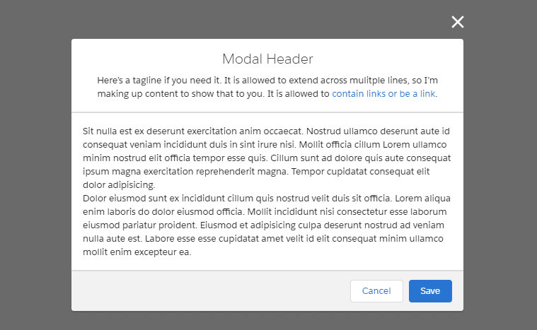
I’m going to take this markup and run with it. There’s one crucial piece of markup, in particular, that we’ll need to wrap in a <template if:true> flag:
<template>
  <section>
    <!-- the rest of the modal content here -->
  </section>
  <template if:true="{isOpen}">
    <div class="slds-backdrop slds-backdrop_open"></div>
  </template>
</template>
That singular <div> at the bottom applies the styles necessary to gray out the remainder of the screen. We’ll utilize an isOpen property on the LWC JavaScript controller to determine whether or not to show this. We can also make use of this singular flag to address some accessibility concerns presented in the Lightning Design System documentation:
When the modal is open, everything behind it has HTML attribute
aria-hidden="true", so assistive technology won’t read out the underlying page. The best way to do this is to give the modal and the page separate wrapper elements and togglearia-hidden="true"/aria-hidden="false"on the main page’s wrapper depending on whether or not the modal is open.
At first I took the documentation seriously and created a wrapper element; later I was able to handle all of the aria attributes correctly inside of the modal LWC alone. That said, we’ll need to control not only the aria-hidden attributes, but also the CSS styles to show/hide the modal. Something like this will do:
export default class Modal extends LightningElement {
  isOpen = false;

  // this has to be public so consumers of the modal can tell it to open!
  @api
  toggleModal() {
    this.isOpen = !this.isOpen;
  }
  // the crucial CSS necessary to show/hide the modal
  @api
  get cssClass() {
    const baseClass = "slds-modal ";
    return (
      baseClass +
      (this.isOpen ? "slds-visible slds-fade-in-open" : "slds-hidden")
    );
  }

  // we have to use a separate property for this because you can't negate in markup
  @api
  get modalAriaHidden() {
    return !this.isOpen;
  }
}
That means our modal’s baseline markup will look something like:
<template>
  <section aria-hidden="{isOpen}" class="outerModalContent">
    <slot name="body"></slot>
  </section>
  <section
    aria-describedby="modal-content-id-1"
    aria-hidden="{modalAriaHidden}"
    aria-labelledby="modal-heading-01"
    aria-modal="true"
    class="{cssClass}"
    role="dialog"
    onclick="{toggleModal}"
  >
    <div class="slds-modal__container outerModalContent">
      <div tabindex="0" onfocus="{handleModalLostFocus}">
        <template if:true="{modalHeader}">
          <header class="slds-modal__header">
            <h2 id="modal-heading-01" class="slds-modal__title slds-hyphenate">
              {modalHeader}
            </h2>
            <template if:true="{modalTagline}">
              <p class="slds-m-top_x-small">{modalTagline}</p>
            </template>
          </header>
        </template>
        <div
          class="slds-modal__content slds-p-around_medium"
          id="modal-content-id-1"
        >
          <slot name="modalContent"></slot>
        </div>
        <footer class="slds-modal__footer">
          <button
            class="slds-button slds-button_neutral focusable"
            onclick="{closeModal}"
          >
            Cancel
          </button>
          <template if:true="{modalSaveHandler}">
            <button
              class="slds-button slds-button_brand focusable"
              onclick="{modalSaveHandler}"
            >
              Save
            </button>
          </template>
        </footer>
      </div>
    </div>
  </section>
  <template if:true="{isOpen}">
    <div class="slds-backdrop slds-backdrop_open"></div>
  </template>
</template>
So, what do we have?
- some public properties that users of the modal will need to supply; most notably, the optional parameters:
modalHeader,modalTagline(strings) andmodalSaveHandler(a function) that can be used to display a save button and wire up logic for handling form elements/elements in the modal on submission - some references to click handlers;
closeModalandtoggleModalprobably need no description, but what the heck is going on with thathandleModalLostFocusfunction?? - the crucial slots that will be used:
bodyfor everything not in the modal that is part of the parent Lightning Web Component, andmodalContentfor … everything in the modal. - the addition of a
focusableCSS class to be used as a selector for tabbable component elements - an
outerModalContentCSS class to be used as a selector (an excellent contribution by Justin Lyon, see the “Contributions” section at the end for more info!)
Handling Clicks And Key Presses Properly For Modals
Of what’s shown above, there are two complicated pieces to address:
- closing the modal when the ESC is pressed or when the area outside the modal is clicked
- enforcing that tab/shift-tab does not move focus to an element outside of the modal while it is opened
It took quite a few iterations to get things working satisfactorily, and there’s still a big caveat (which is why I went through the aside on the Shadow DOM, earlier). Closing the modal is complicated because if the element is not in focus properly when first opened, the ESC keypress won’t be “heard”, and thus the modal won’t close. The modal also technically takes up more than the visible area shown in the example; technically, its bounds extend to the top and bottom of the page (this works in tandem with the aforementioned <div class="slds-backdrop slds-backdrop_open"> to effectively lock navigation while the modal is open). However, if clicks outside the modal are supposed to close it, but we’re technically still clicking in the modal’s list of DOM nodes … that’s going to represent an issue. Luckily, this one can be handled somewhat gracefully by appending the specific outerModalContent class to the “outer” sections of the modal.
Once again, there is a key snippet included in the docs (this time in the “Run Code When A Component Is Inserted Or Removed From The DOM” section) that gives us a clue as to how to proceed:
The
connectedCallback()lifecycle hook fires when a component is inserted into the DOM. ThedisconnectedCallback()lifecycle hook fires when a component is removed from the DOM. The framework takes care of managing and cleaning up listeners for you as part of the component lifecycle. However, if you add a listener to anything else (like the window object, the document object, and so on), you’re responsible for removing the listener yourself.
Aha. The window object is available. But be warned — here be dragons:
import { api, LightningElement } from "lwc";

const ESC_KEY_CODE = 27;
const ESC_KEY_STRING = "Escape";
const FOCUSABLE_ELEMENTS = ".focusable";
const OUTER_MODAL_CLASS = "outerModalContent";
const TAB_KEY_CODE = 9;
const TAB_KEY_STRING = "Tab";

export default class Modal extends LightningElement {
  isFirstRender = true;
  isOpen = false;

  constructor() {
    super();
    this.template.addEventListener("click", (event) => {
      const classList = [...event.target.classList];
      if (classList.includes(OUTER_MODAL_CLASS)) {
        this.toggleModal();
      }
    });
  }

  renderedCallback() {
    if (this.isFirstRender) {
      this.isFirstRender = false;

      // the "once" option for `addEventListener` should auto-cleanup
      window.addEventListener("keyup", (e) => this.handleKeyUp(e), {
        once: true,
      });
    }
  }

  @api modalHeader;
  @api modalTagline;
  @api modalSaveHandler;

  @api
  toggleModal() {
    this.isOpen = !this.isOpen;
    if (this.isOpen) {
      const focusableElems = this._getFocusableElements();
      this._focusFirstTabbableElement(focusableElems);
    }
  }

  @api
  get cssClass() {
    const baseClass = "slds-modal " + OUTER_MODAL_CLASS + " ";
    return (
      baseClass +
      (this.isOpen ? "slds-visible slds-fade-in-open" : "slds-hidden")
    );
  }

  @api
  get modalAriaHidden() {
    return !this.isOpen;
  }

  closeModal(event) {
    event.stopPropagation();
    this.toggleModal();
  }

  handleModalLostFocus() {
    const focusableElems = this._getFocusableElements();
    this._focusFirstTabbableElement(focusableElems);
  }

  handleKeyUp(event) {
    if (event.keyCode === ESC_KEY_CODE || event.code === ESC_KEY_STRING) {
      this.toggleModal();
    } else if (
      event.keyCode === TAB_KEY_CODE ||
      event.code === TAB_KEY_STRING
    ) {
      const focusableElems = this._getFocusableElements();
      if (this._shouldRefocusToModal(focusableElems)) {
        this._focusFirstTabbableElement(focusableElems);
      }
    }
  }

  _shouldRefocusToModal(focusableElems) {
    return focusableElems.indexOf(this.template.activeElement) === -1;
  }

  _getFocusableElements() {
    /*a not obvious distinct between slotted components
      and the rest of the component's markup:
      markup injected by slot appears with this.querySelector
      or this.querySelectorAll; all other markup for a component
      appears with this.template.querySelector/querySelectorAll.
      unfortunately, at the present moment I cannot use the focusable
      elements returned by this.querySelectorAll, because this.template.activeElement
      is not set when markup injected via slot is focused. I have filed
      an issue on the LWC github (https://github.com/salesforce/lwc/issues/1923)
      and will fix the below lines once the issue has been resolved

      const potentialElems = [...this.querySelectorAll(FOCUSABLE_ELEMENTS)];
      potentialElems.push(
          ...this.template.querySelectorAll(FOCUSABLE_ELEMENTS)
      ); */

    const potentialElems = [
      ...this.template.querySelectorAll(FOCUSABLE_ELEMENTS),
    ];
    return potentialElems;
  }

  _focusFirstTabbableElement(focusableElems) {
    if (focusableElems.length > 0) {
      focusableElems[0].focus();
    }
  }
}
The keyup listener ends up living on the window object, which is necessary to detect ESC presses if the modal is open but not focused.
In the example usage of the modal component on my Github, I show off what a consumer of the modal ends up looking like:
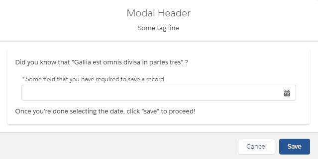
In the example, the modal_wrapper attempts to use the focusable CSS class to allow its date component to be focusable by the keyup listener. The ideal “tab order” for this component is:
- First tab selects the date-picker element
- Second tab selects the cancel button
- Third tab selects the save button
Unfortunately, this doesn’t quite pan out (as mentioned in the commented out section above for this._getFocusableElements()). I am hopeful that the Github issue that I have filed with the LWC team will (eventually) be addressed, but at the moment, there’s no good way to detect when an element injected by means of a <slot> has been focused. There is a workaround, of sorts, but it’s not pretty:
handleKeyUp(event) {
  // the rest of the method is omitted
  else if (
    event.keyCode === TAB_KEY_CODE ||
    event.code === TAB_KEY_STRING
  ) {
    const focusableElems = this._getFocusableElements();
    if (this._shouldRefocusToModal(focusableElems)) {
        this._focusFirstTabbableElement(focusableElems);
    }
  }
}

_shouldRefocusToModal(focusableElems) {
    return (
        focusableElems
            .map(elem =>
                elem.toString().replace('SecureElement', 'SecureObject')
            )
            .indexOf(document.activeElement.toString()) === -1
    );
}

_getFocusableElements() {
  const potentialElems = [...this.querySelectorAll(FOCUSABLE_ELEMENTS)];
  potentialElems.push(
      ...this.template.querySelectorAll(FOCUSABLE_ELEMENTS)
  );

  return potentialElems;
}
The gist of the workaround that has been posted on one of the associated Github issues doesn’t apply here; the document’s shadowRoot object isn’t accessible by the component when the handler is invoked, and the activeElement on the document only has a toString method publicly available. Add the Lightning Locker Service into the equation, which makes comparing the activeElement on the document impossible against the HTMLNodeList returned by this_getFocusableElements, and this insane string comparison is the only option left on the table. While I might feel comfortable doing something like this in my own sandbox / scratch org, I wouldn’t ever use it at production level (even if it works, which it does).
Unless a method is exposed via the same modal that this.querySelector/querySelectorAll works to access <slot> based markup that is focused, I’m happy with the component as-is, with the below tab order:
- First tab selects the cancel button
- Second tab selects the save button
Example Modal Implementation
The markup necessary for a consumer to add the modal to their own markup is quite minimal:
<template>
  <c-modal
    modal-header="Modal Header"
    modal-tagline="Some tag line"
    modal-save-handler="{modalSaveHandler}"
  >
    <p slot="body">This stuff can't be tabbed to when the modal is open</p>
    <div
      slot="modalContent"
      class="modalContent slds-modal__content slds-p-around_medium"
    >
      <p>Did you know that "Gallia est omnis divisa in partes tres" ?</p>
      <!-- not obvious, but "slds-form-element" applies
 the styles necessary for this element to "pop out" of the modal
 instead of adding scrolling to the inner container
  -->
      <lightning-input
        class="slds-form-element slds-m-around_small focusable"
        label="Some field that you have required to save a record"
        type="date"
        date-style="short"
        required
      ></lightning-input>
      <p>Once you're done selecting the date, click "save" to proceed!</p>
    </div>
  </c-modal>
  <button class="slds-m-left_small" onclick="{handleClick}">
    Click me to open modal
  </button>
</template>
And the example JavaScript controller:
import { LightningElement } from "lwc";
import { ShowToastEvent } from "lightning/platformShowToastEvent";

export default class ModalWrapper extends LightningElement {
  handleClick() {
    this.template.querySelector("c-modal").toggleModal();
  }

  // we have to use the fat arrow function here
  // to retain "this" as the wrapper context
  modalSaveHandler = (event) => {
    // normally here you would do things like
    // validate your inputs were correctly filled out
    event.stopPropagation();
    this.handleClick();
    this.dispatchEvent(
      new ShowToastEvent({
        title: "Success",
        variant: "success",
        message: "Record successfully updated!",
      })
    );
  };
}
If you were using Lightning Data Service or an Apex Controller to save a record in the modalSaveHandler, you would just need to make the function async and only display the toast (or an error) after awaiting the DML operation. Another thing to keep in mind is that if you weren’t exposing the modal through a button, and instead were responding to a form element / input changing to some sentinel value, you wouldn’t need handleClick to be a public method.
Modal Wrap-Up
If you need to implement a pop-up modal into your own components, the source code from this post is available on my Github. Despite the issues in correctly focusing the inner contents of the modal (assuming you have elements you want to add that are in fact focusable), I like how clean the separation of concerns becomes:
- the modal only needs to know about saving if that’s something the parent cares about
- the parent only needs to tell the modal to close if a save operation is successful
- the modal can choose whether or not to display a title/subtitle if the parent so dictates it, but the parent doesn’t need to concern itself with that markup logic
- the parent doesn’t need to concern itself with accessibility (though if the parent Lightning Web Component wasn’t top-level, you might need to consider some kind of delegration strategy to correctly mark the
ariaattributes properly)
This is a clean departure from the example modal that’s part of the LWC-recipes on Github. Like the example pager I've also shared, I wrote this article to help people bridge the gap between the simple examples shown on Trailhead/Github and the practical, complicated edge-cases associated with actually using a component like this in production.
I hope you’ve enjoyed the latest in the Joys Of Apex. Writing about Lightning Web Components has proven to be extremely satisfying, and I may spend some time documenting the tests for a component like this next if there is enough interest. When I first started writing about LWC (in comparison to React), I had assumed that the usage of Jest was already very established within the SFDC community. Since then, I’ve had some feedback (and seen some questions online) that have made me realize people are still hungry to see testing examples. Since then, I’ve also written and published Advanced LWC Jest Testing which I highly recommend for people looking to level up their LWC Jest testing skills. The modal makes another appearance in Dynamic LWC Creation, which was a really fun deep dive into how Screen Flows and LWC can interact with one another.
Contributions
- many thanks to reader and SFXD Discord frequenter havana59er for his contributions to the article. His investigation into assigning the
tabindexproperty to different sections of the modal, additionalhandleModalLostFocushandler, and short-circuit feedback forrenderedCallbackwere all excellent. I’m much obliged, and the modal is better off! - hats off to Justin Lyon, another SFXD Discord frequenter and fellow LWC enthusiast for experimenting with his own modal. He managed to shave off one of the existing
windowevent listeners by the use of explicit classes to determine when the modal should be closed. The post has been updated to reflect this; however, I leave the original solution below because I believe thatgetBoundingClientRect()is something you should know about when considering your options for examining the size of a contiguous DOM section!
The original solution for determining when a click was outside the modal looked like this (some sections of the controller omitted for brevity’s sake):
export default class Modal extends LightningElement {
  isFirstRender = true;
  modalDimensions = {
    top: 0,
    left: 0,
    bottom: 0,
    right: 0,
  };
  eventListeners = [
    { name: "resize", listener: () => this._setModalSize() },
    { name: "keyup", listener: (e) => this.handleKeyUp(e) },
  ];

  renderedCallback() {
    // always best to short-circuit when adding event listeners
    if (this.isFirstRender) {
      this.isFirstRender = false;
      this._setModalSize();
      for (let eventListener of this.eventListeners) {
        window.addEventListener(eventListener.name, eventListener.listener);
      }
    }
  }

  handleInnerModalClick(event) {
    // stop the event from bubbling to the <section>
    // otherwise any click, anywhere in the modal,
    // will close it
    event.stopPropagation();

    const isWithinInnerXBoundary =
      event.clientX >= this.modalDimensions.left &&
      event.clientX <= this.modalDimensions.right;
    const isWithinInnerYBoundary =
      event.clientY >= this.modalDimensions.top &&
      event.clientY <= this.modalDimensions.bottom;
    if (isWithinInnerXBoundary && isWithinInnerYBoundary) {
      // do nothing, the click was properly within the modal bounds
      return;
    }
    this.toggleModal();
  }

  _setModalSize() {
    // getBoundingClientRect() is one of those
    // life-saving JS APIs you should know!
    const innerModalDimensions = this.template
      .querySelector(INNER_MODAL_CLASS)
      .getBoundingClientRect();
    this.modalDimensions { ... innerModalDimensions };
  }